True X
truexwealth
2 Months
2024
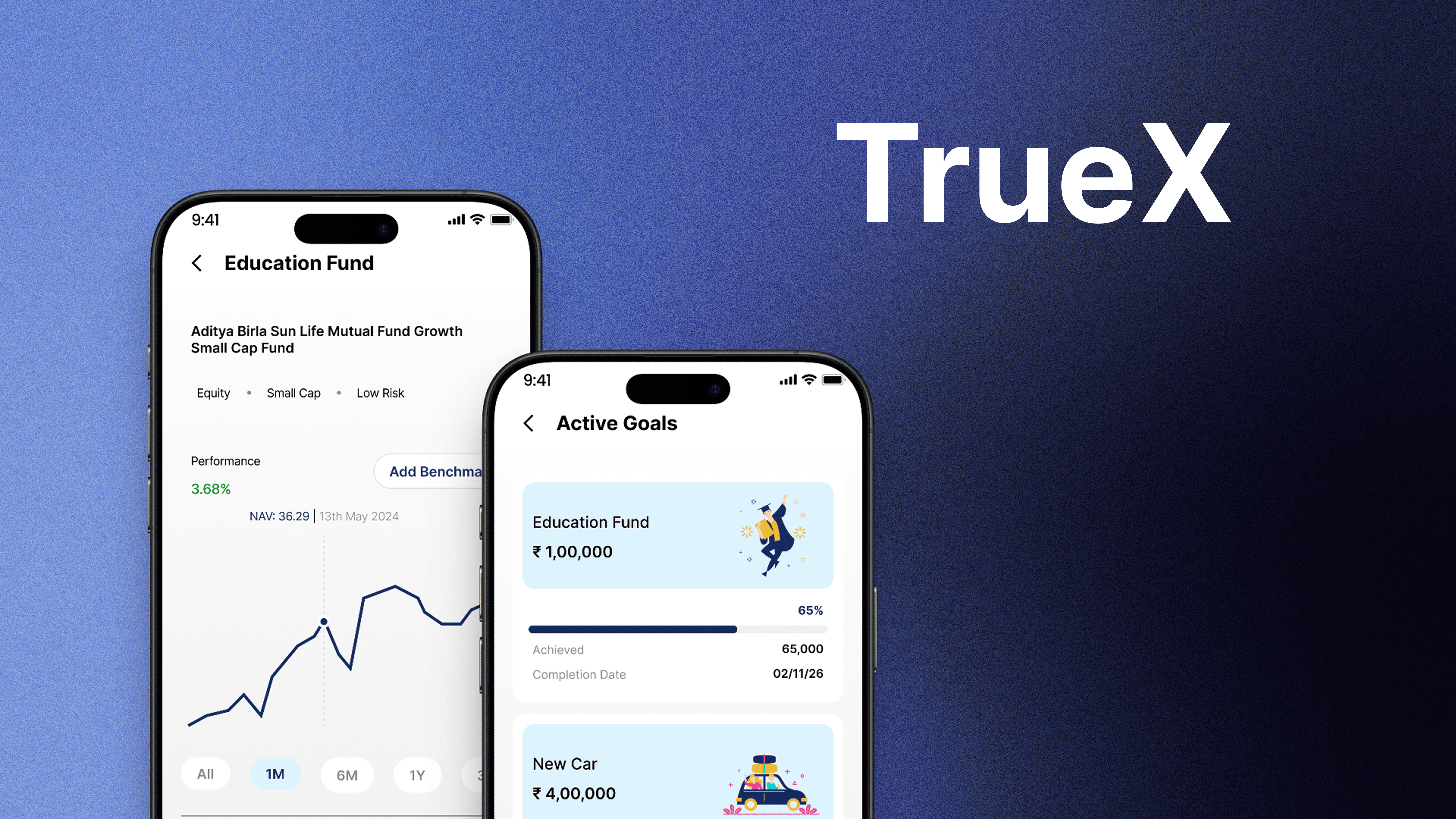
TrueX is a fintech investment platform designed to help users discover, compare, and invest in mutual funds and SIPs with clarity, confidence, and minimal financial jargon.
First-time and retail investors often feel overwhelmed by complex financial terms, excessive choices, and unclear risk explanations. Existing platforms focus heavily on data and performance metrics, making it difficult for users to understand what to invest in and why.
I designed an investment experience that simplifies decision-making through guided flows, clear explanations, and outcome-driven comparisons. TrueX balances trust, transparency, and usability—helping users move from discovery to investment with confidence.
I followed a Design Thinking approach, prioritizing trust, comprehension, and ease of decision-making in a high-stakes financial context.
Identified user anxieties around risk, credibility, and choice overload
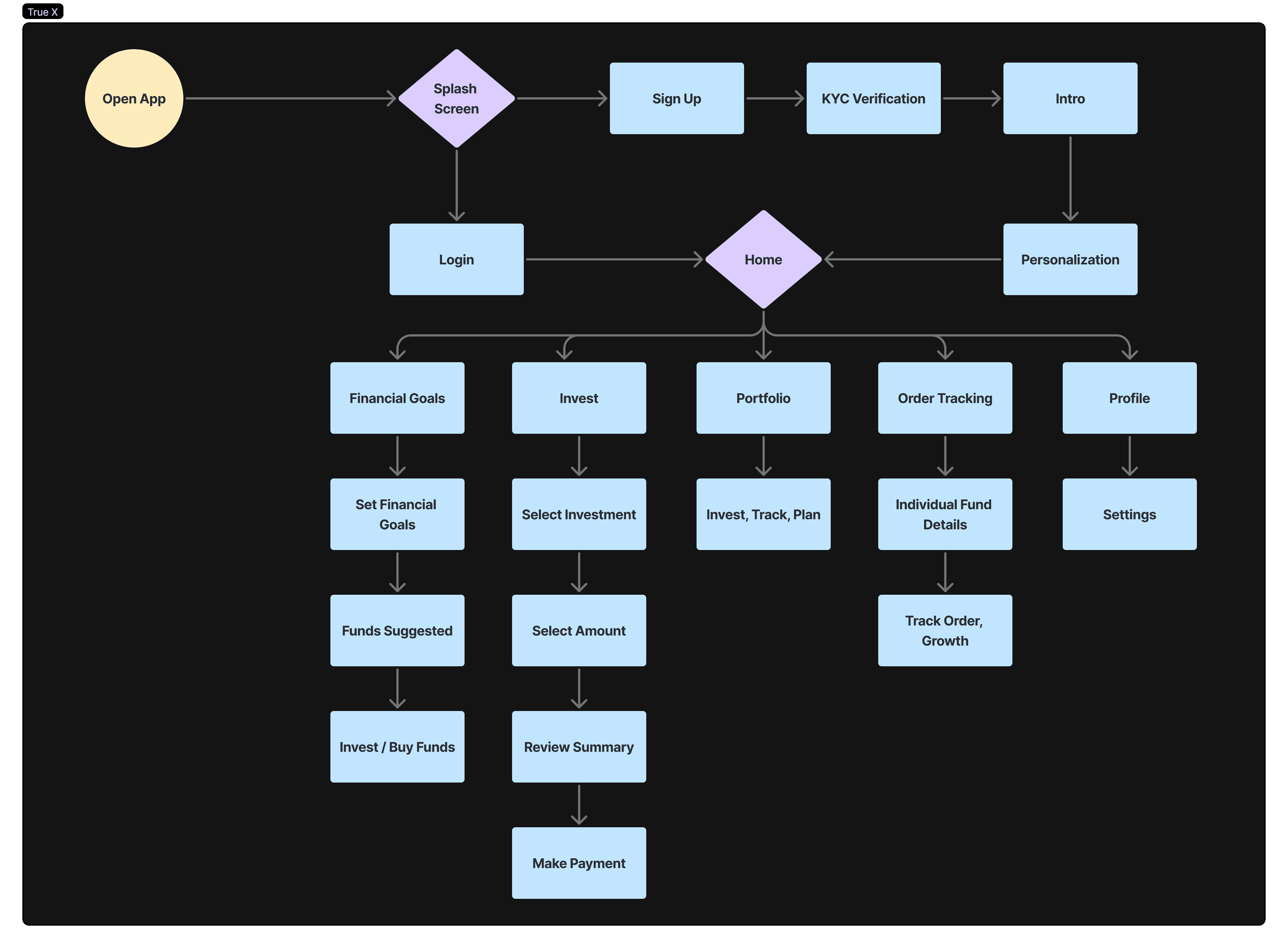
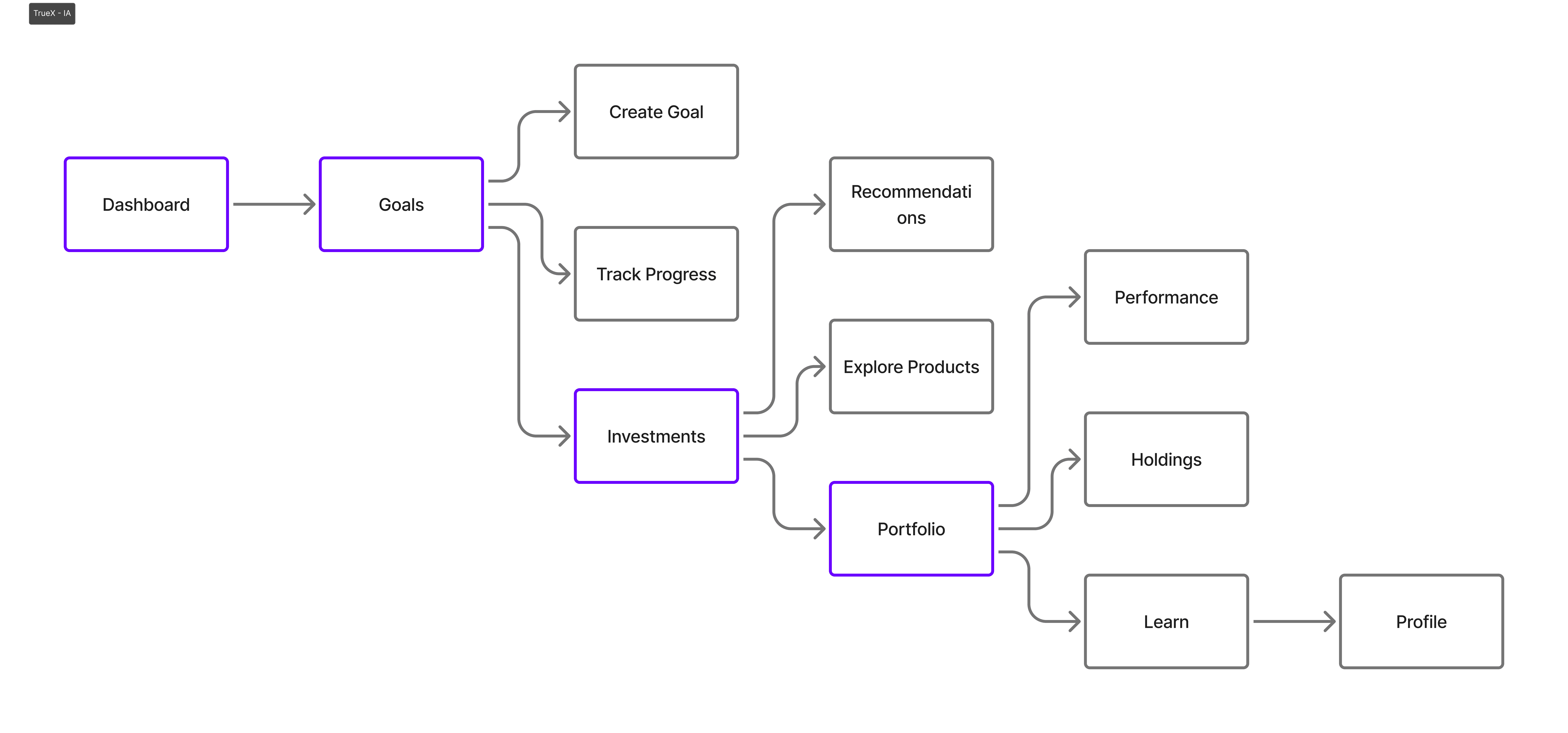
Structured user flows from onboarding → discovery → comparison → investment
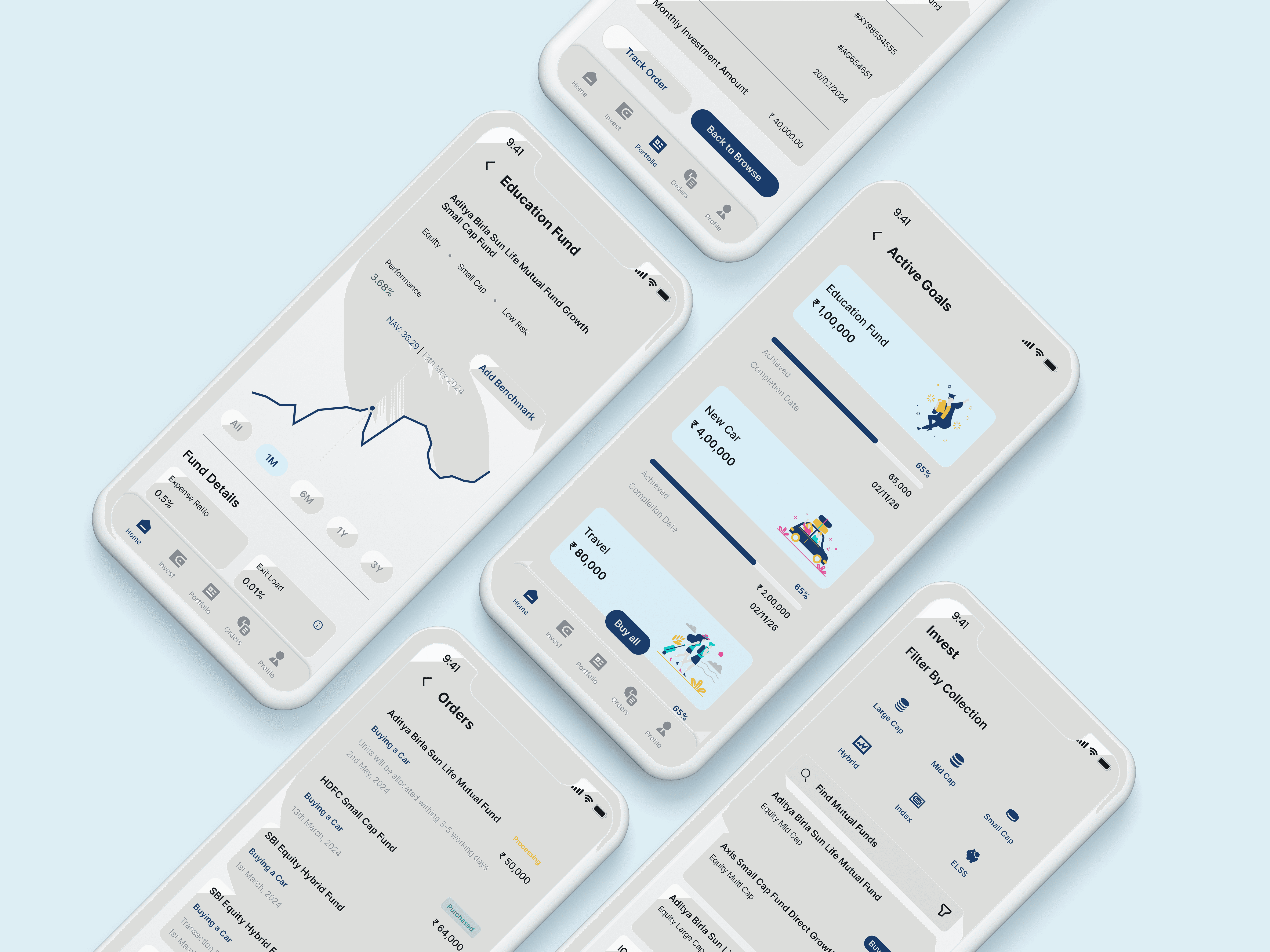
Designed simplified plan cards, guided recommendations, and jargon-free explanations
Focused on progressive disclosure to reveal complexity only when needed
Designed clean, reassuring UI patterns aligned with fintech trust principles
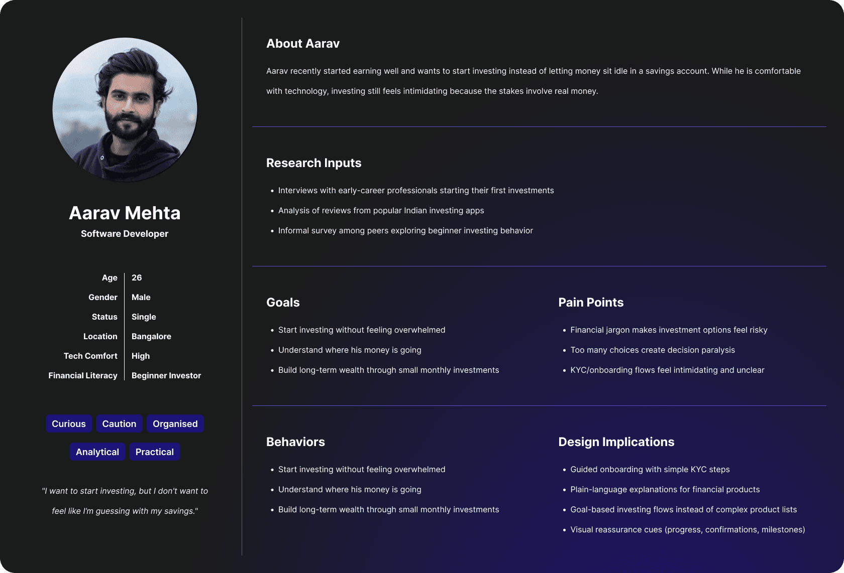
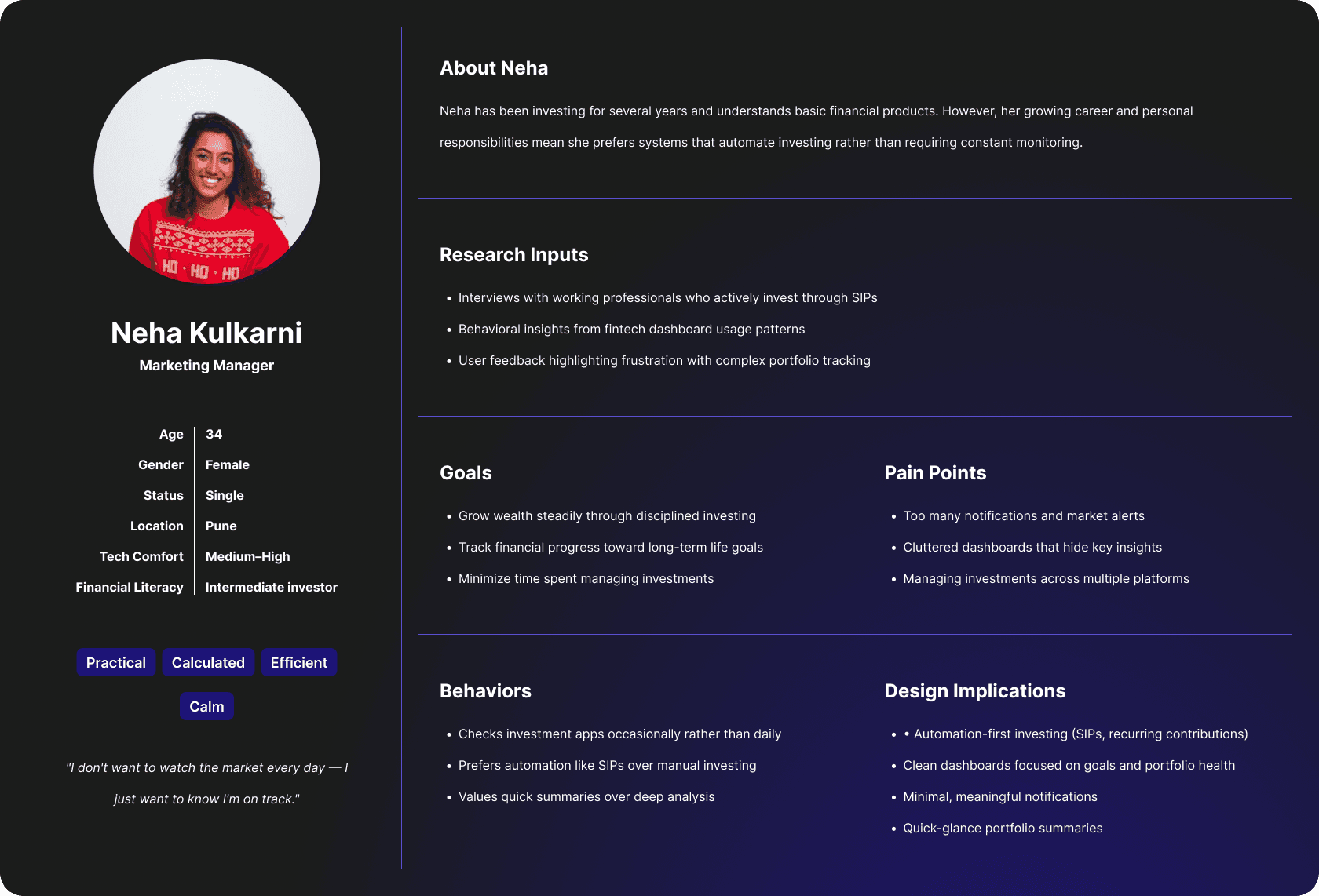
We interviewed 8 first-time retail investors between 22 and 35. All had downloaded at least one mutual fund app. Only 3 had actually invested.
The blocker wasn't confusion about what a mutual fund is. It was a specific kind of anxiety: "What if I pick the wrong one?" Existing apps respond to this by giving more data — more charts, more historical returns, more risk metrics. That made it worse.
What people actually wanted was permission to start small. The key insight: frame the first investment as reversible and low-stakes, not as a long-term commitment. That informed everything — the onboarding copy, the SIP amount defaults, even the confirmation screen wording.
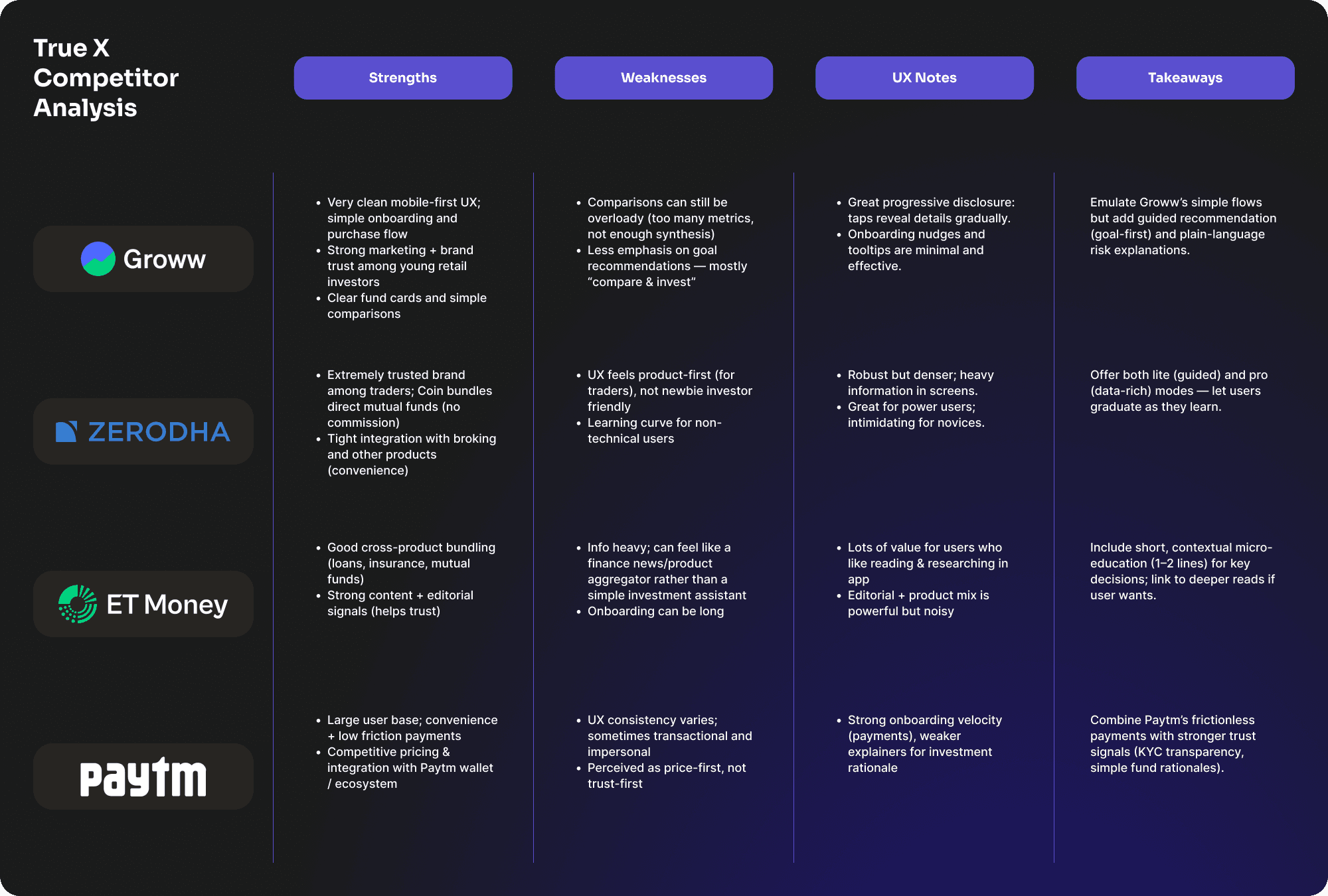
I spent a week as a first-time investor across Groww, Kuvera, and Zerodha. Groww is quick to onboard but drops you into 1,200 funds with no guidance. Zerodha is powerful — and completely terrifying if you don't already know what a NAV is. Kuvera has goal-based flows but buries the comparison tool three taps deep. TrueX's job: get someone from "I want to invest" to "I just invested" without them having to become a financial expert first.


Key UX Decisions
1. No red for negative returns. Every competitor uses red for negative performance — it triggers loss aversion and spikes anxiety in first-time investors at exactly the moment they need to stay calm. We used amber instead. The number is the same; the emotional read is different. "Down 2.3%" in amber reads as a signal to watch. In red, it reads as an emergency.
2. Progressive disclosure for risk labels. Showing a fund's risk rating (Low / Moderate / High) upfront killed conversion in early screens — users who saw "High Risk" immediately before understanding returns just exited. We moved risk details behind a tap, placing them at the point when users had already read the return history and the what-is-this fund summary. Context before consequence.
3. Recommended SIP amounts were anchors, not suggestions. Rather than asking "how much do you want to invest?", we pre-populated a recommended SIP amount based on goal and timeline. Users still had full control to change it. But giving them a number to react to — rather than a blank field to fill — cut the average decision time from 4.1 minutes to 1.8 minutes in our flows.
Avg. time to select and set up a SIP
↓ from 4.1 min in early flow testing
Users understood their risk exposure without reading the tooltip
Comprehension test, n=8
Users who asked "what does this risk rating mean?" after v2
vs. 5 in v1
"I trust this app with my money" — post-session rating
n=8, post-session survey
I tested the prototype with 5 first-time investors, recruited from peers who had downloaded a mutual fund app but never completed a purchase. 4 out of 5 set up a SIP without any assistance. The one who got stuck did so on the "risk level" card — which told me the copy, not the design, was the problem. Post-session: average trust rating was 7.6 out of 10, up from 4.2 when shown a Groww screenshot of the same flow. One participant said "I finally understood what moderate risk actually means for my money" — which is exactly what I was going for.