CTOS
iCounter
Ongoing
2025 - 2026
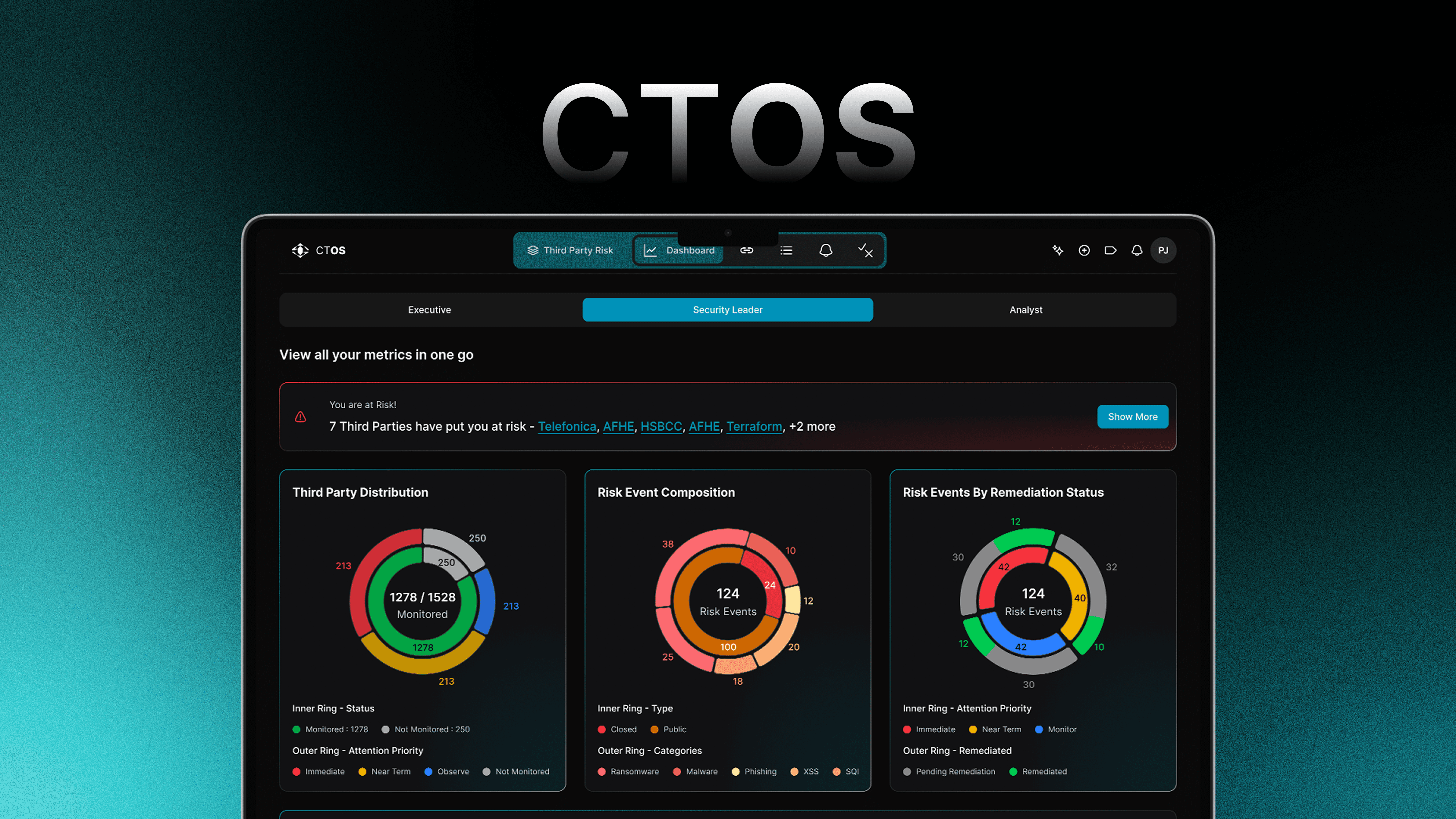
iCounter is an enterprise-grade Third Party Risk Management (TPRM) platform built for security-conscious organisations managing dozens to hundreds of external vendor relationships. I'm the lead designer on this at Roxiler Systems — responsible for the full UX, from initial research through to production-ready handoffs and sprint support. The platform gives risk managers, compliance officers, and CISOs a single place to discover vendor threats, assess exposure, and track remediation — without living in spreadsheets and email threads.
Most enterprise security teams know their internal infrastructure reasonably well. Their vendors are a different story. Contractors, SaaS tools, third-party integrations — each one is a potential attack surface. And most organisations track all of it in a spreadsheet someone started three years ago and no one fully trusts. iCounter's users deal with a specific kind of pressure: something goes wrong with a vendor's security posture at 11pm, and they need to know in seconds whether it affects them, how badly, and what to do about it. The old interface didn't support that. It was a data dump with no hierarchy.
I was embedded with the CTOS product team throughout — not handed a brief and left to design in isolation. That meant sitting in sprint planning, joining QA reviews, and having real conversations with the developers when a design decision didn't work in implementation.
The biggest early challenge was scope. A TRPM tool can mean many things: questionnaire management, vendor scoring, compliance reporting, contract tracking, incident response. We couldn't build all of it first. I ran a prioritization workshop with the PM and two senior security analysts to map every potential feature against two axes: how often would users need this, and how painful is the current workaround?
That exercise surfaced three clear priorities: real-time risk visibility, analyst assessment workflows, and the CISO dashboard. Everything else went to the backlog.
I designed the CISO dashboard first — not because it's the most complex, but because it's the most visible. If the executive buyer doesn't immediately understand the product's value, nothing else matters.
I ran 12 interviews across risk managers, compliance officers, and one CISO. Most of the insights came not from what people said they wanted, but from what they showed me — spreadsheets with 40 columns, colour-coded tabs that only one person understood, and Slack threads that served as an improvised incident log.
Top frustrations:
78% — no real-time visibility into vendor risk changes
65% — manual, time-consuming reporting (building reports for the board took 2–3 days)
54% — data was siloed across email, spreadsheets, and assessment PDFs
41% — no way to prioritise which vendor to look at first
The clearest finding: risk managers have three jobs — assess, monitor, and report. The old interface treated all three the same. The redesign separates them.
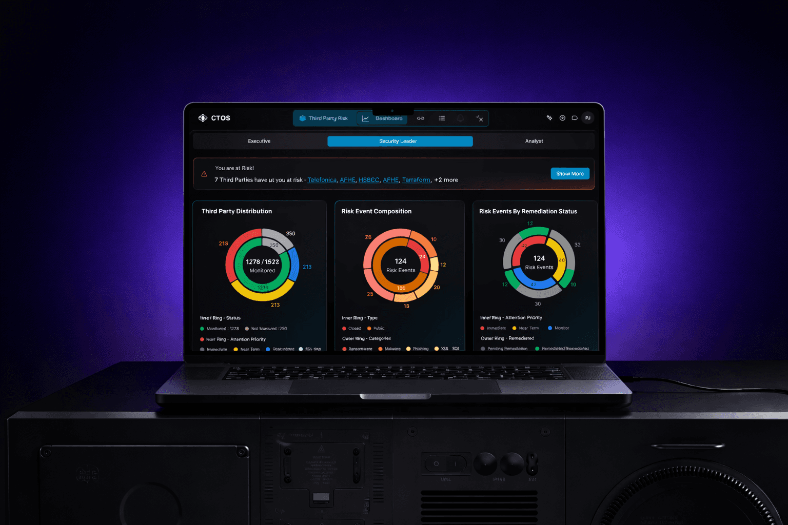
See it in action
Attached below is a live prototype showcasing a complete end to end demo of how the actual product looks, feels and behaves. For best results, please view this on a desktop / Tablet.
Key UX Decisions
After the pilot launch with 12 users across two security teams, the numbers were clear. Vendor risk assessment time dropped from 3.2 hours to 47 minutes on average — a change the team attributed primarily to the chunked assessment workflow and the pre-populated vendor data fields.
91% of security analysts rated the risk tier system as "immediately understandable" in a post-launch usability test, without any onboarding explanation. Nobody needed to be told what a red ring meant.
The CISO dashboard was built into the monthly board reporting pack within 6 weeks of launch. The previous process for that slide took one person 2 hours. It now takes 10 minutes.
The result I'm most proud of: all 12 pilot users self-onboarded with no training sessions required. In a product category where 6-week implementation timelines are the norm, that felt like the real win.
of security professionals tracked vendors in spreadsheets or shared docs
Discovery interviews, n=9
Average time to complete one vendor risk assessment
Observed across 3 org workflows
Had no visibility into nth-party risk (vendors of their vendors)
Discovery interviews, n=9
Described existing enterprise TRPM tools as "too complex to actually use"
Discovery interviews
The thing I underestimated: the complexity of the alert system. Right now, the alert feed shows all alerts chronologically. Analysts told us — after launch — that they'd prefer to filter by vendor category and severity simultaneously. We designed filtering, but not combined filtering. That's a V2 priority. I also think the onboarding experience for new security analysts could be better. Self-onboarding worked, but two users mentioned they didn't realize the assessment workflow auto-saved their progress, so they were afraid to close the tab. A simple "Progress saved" toast on each step would've fixed that — an easy catch that slipped through our QA cycle.